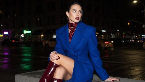
Zara’s autumn rail has become the reference point for a colour conversation the UK has been having all week, but it’s worth separating two things that keep getting merged in the same search box. This isn’t autumn colour analysis, the seasonal skin-tone system that tells you whether you’re a “warm autumn” or a “deep winter”. This is a wardrobe trend: a specific, repeatable edit of shades that Who What Wear named and tracked as this season’s defining palette, and that Zara’s own rails now echo almost shade for shade.
The reason it’s landing hard in the UK right now is timing. FW26 collections have finished filtering down from runway to high street, autumn wardrobe refreshes are in full swing, and shoppers are actively hunting for the exact hex codes that will make last year’s coat look wrong and this year’s look expensive. The gap this trend closes is knowing which shades are the real signal and which are just autumn as usual.
The signal: Zara’s six autumn shades, confirmed by Who What Wear
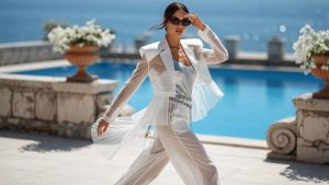
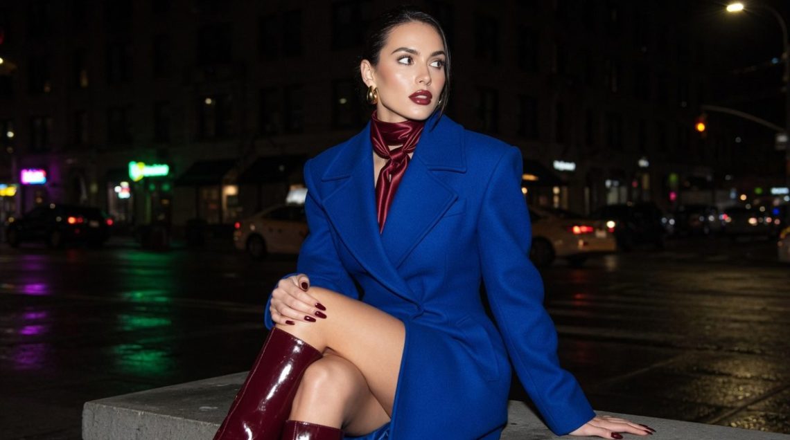
Who What Wear was the outlet that put a name to the pattern, confirming a tight edit of colours it identified as the ones defining the season: Klein blue (a punchy, saturated cobalt), royal purple leaning into aubergine, deep burgundy, olive green, a sharper greenish-yellow, and a burnt-umber persimmon, with turquoise trailing close behind as a near-seventh. Zara’s own autumn rails have picked up the same shades almost item for item, which is why the trend reads less like a fluke and more like a genuine cross-industry consensus.
What makes it useful rather than just decorative is that it’s checkable against the rest of the high street. Mango, COS, M&S and & Other Stories have all leaned into some version of this same jewel-toned register this autumn, which suggests the palette isn’t a Zara exclusive so much as a shared seasonal instinct that’s easy to shop across price points rather than chase in one shop.
Where the palette comes from: FW26 runways and colour theory
The runway lineage is traceable. Jil Sander’s FW26 show leaned hard into that same Klein blue, Bottega Veneta and Patou both worked variations of the deeper jewel register, and JW Anderson alongside Xu Zhi pushed turquoise into the same conversation. High-street colour stories rarely appear from nowhere; they’re usually a compressed, delayed echo of what showed on runways two seasons earlier, and this is a clean example of that pipeline working as intended.
The “expensive” read isn’t just branding, it’s colour theory. Saturated jewel tones like cobalt, burgundy and aubergine carry high value contrast against skin and against each other, which is exactly the kind of visual clarity the eye associates with intention and cost. Pastels do the opposite: washed-out, low-chroma shades flatten contrast and can make an outfit read as faded or cheap, even when the garment itself is well made. That’s the real mechanism behind why this particular edit of colours photographs and reads as luxurious in a way that dusty pinks and soft lilacs simply don’t.
How to wear it: matte finishes and head-to-toe tonal dressing
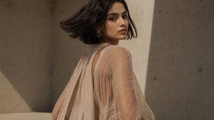
Colour alone won’t get you there, finish matters just as much. In this palette specifically, a brushed or matte surface reads as considered and expensive, while the exact same hue in a glossy synthetic finish tips straight into cheap-looking. A matte burgundy wool coat and a shiny burgundy polyester one are not the same trend, even if a swatch card would call them identical.
The single trick worth borrowing from stylists is monochrome dressing: building an outfit head-to-toe in one of these shades, in slightly different tones and textures, rather than treating the colour as one accent piece against neutrals. Head-to-toe burgundy with a matte knit, a slightly darker trouser and a burnished leather boot does more work than a single burgundy jumper ever could, because tonal layering removes the visual noise that makes an outfit look thrown together. The same logic applies to olive: a matte olive coat over a slightly deeper olive knit reads considered in a way one olive item on its own can’t.
With retailers reporting rising interest in this palette as autumn ranges bed in, the real question is which of these six shades UK shoppers will actually commit to first, and whether cobalt or burgundy ends up being the one everyone claims they spotted before it was everywhere.