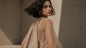
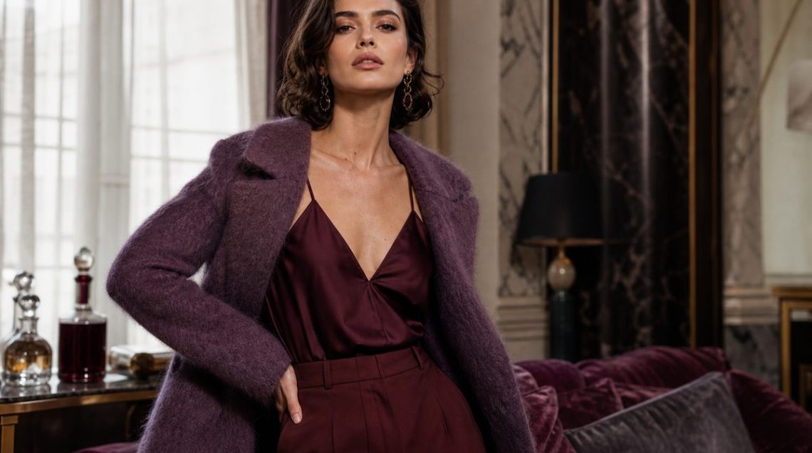
The Great British Wardrobe Clearout of 2026 has a new target: that burgundy midi skirt you wore on repeat last autumn, and the aubergine knit that felt so directional in 2024. Search interest for burgundy peaked at 100 in July 2024 and has since flatlined, and now the fashion calendar has delivered its verdict. Pantone’s AW25/26 Fashion Trendsetter report names Damson, Winterberry, and Mauve Wine as the successor shades, and they’re already dominating the Paris runways from Sarah Burton’s Givenchy to Matthieu Blazy’s Chanel.
This isn’t a subtle shift. It’s a tonal recalibration that changes how you layer, what you pair it with, and where you wear it. The new dark-jewel palette is showing up in chiffon and pointelle, not just leather and suede, meaning the styling rules have fundamentally changed.
So what exactly is replacing burgundy and aubergine this season?
The precise answer is Damson and Winterberry, Pantone’s AW25/26 Fashion Trendsetter shades that are lighting up the runways at Alaïa, The Attico, and Christopher Esber. Damson is a blue-based purple-red with less brown undertone than burgundy, which makes it read cooler and sharper under indoor lighting. Winterberry sits slightly lighter, with a cassis-like clarity that works in sheer fabrics. Leatrice Eiseman at the Pantone Colour Institute explains the shift as a move towards ‘complexity without weight’, colours that feel rich but not heavy.
At Akris AW26, there’s a purple-to-red ombré micro-trend that bridges the old burgundy wardrobe to the new palette: think gradient knits that fade from deep wine at the hem to damson at the shoulder. Duran Lantink’s Gaultier showed wine velvet paired with yellow faux fur, proving the shade plays well with unexpected brights. And Demna’s Gucci SS26 quietly carried burgundy forward, but as a continuity signal rather than the lead story.
FashionUnited UK’s AW26 Paris colour report confirms the shift is structural, not seasonal: the new dark-jewel tones are appearing in daywear fabrications, chiffon blouses, pointelle cardigans, that burgundy rarely touched. That changes the styling logic entirely.
Why does damson suddenly look fresher than the burgundy I already own?
Colour theory: burgundy has a warm, brown-leaning base that anchors it to autumn in the mind’s eye. Damson and cassis have a cooler, blue-red base that reads as more neutral and less seasonally locked. That’s why damson works under fluorescent office lighting and burgundy often looks muddy. It’s also why the shade has migrated into interiors, Little Greene’s ‘Adventurer’ aubergine and Graham & Brown’s ‘Divine Damson’ are both 2026 paint launches, signalling that burgundy has reached saturation peak in fashion and moved downstream.
Stylist Jessy Cain famously advised swapping burgundy wherever you’d wear black, treating it as a tonal neutral. That logic now applies even more powerfully to damson and cassis, because the cooler base makes them genuinely interchangeable with charcoal and navy in a way burgundy never quite managed. Chloé’s AW26 collection proved this by styling deep wine skirts with white shirting and loafers, no autumn signifiers required.
How do I actually wear it without looking like I’m trying too hard?
Start with the lightest iteration: a damson pointelle cardigan over a white tee and denim. The knit texture softens the intensity, and the pale base keeps it from reading as a Statement Look. The Attico’s approach is instructive here, they’re showing the shade in slip skirts and camisoles, styled as understatement rather than drama. If you’re nervous, use damson as your third piece: a belt, a bag, a pair of loafers. It registers as intentional without demanding the outfit revolve around it.
The ombré trick from Akris is genuinely useful if you already own burgundy pieces: layer a damson knit over a burgundy midi skirt to create a tonal gradient that feels deliberate rather than matchy. And if you’re replacing rather than supplementing, go for chiffon or jersey first, the new palette’s strength is in lighter fabrications where burgundy always felt too heavy. Pair with cream, pale grey, or even mustard (as Gaultier demonstrated) rather than defaulting to black.
The real shift is psychological: burgundy asked to be styled around, damson asks to be styled with. It’s a base, not a focal point, which is why it’s landing now just as Quiet Luxury’s tonal discipline starts to loosen and we’re ready for colour that doesn’t announce itself.