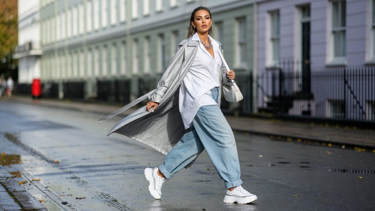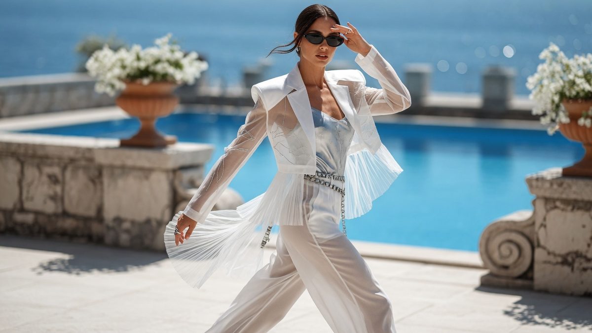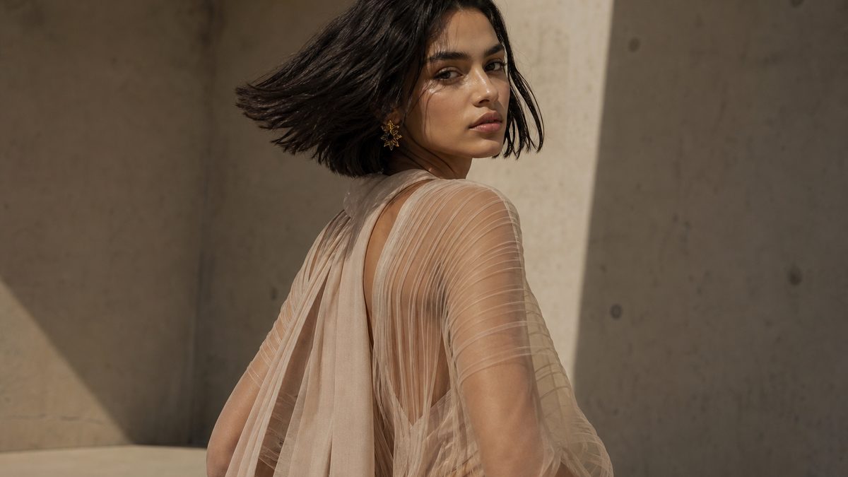
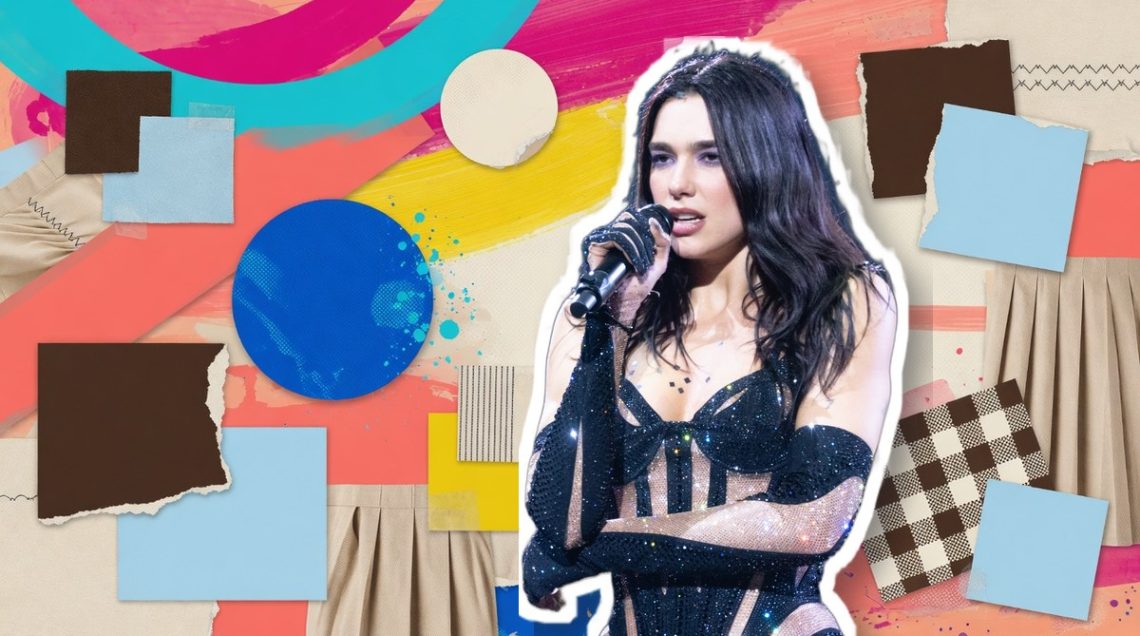

Chocolate brown and baby blue has become the pairing stylists keep reaching for, and it is worth understanding why before you spend another paycheque on separates that don’t talk to each other. The logic is simple once you see it: a warm, grounding neutral set against a cool, chalky pastel, mixed in a ratio that never lets the look tip into costume territory.
It’s part of a wider shift the industry is calling considered colour-blocking, where two hues are chosen for contrast in temperature rather than matching in intensity. Brown and baby blue reads expensive because one colour is doing the talking and the other is simply answering it, and that discipline is exactly what separates a styled outfit from a coincidental one.
Chocolate brown and baby blue: the pairing we’d shop first
Of all the two-colour combinations circulating this season, chocolate brown and sky/baby blue is the one we’d put money on first. It has the credibility of menswear pedigree behind it, most visibly at Celine, where Michael Rider’s SS27 collection leaned into rich, roasted browns offset by cooler, lighter tones, and at Prada’s AW25 show, where warm neutrals were consistently cut against pale, almost powdery blues.
What makes it work on a real body, not just a runway one, is that neither colour is loud. Chocolate brown behaves like a neutral, doing the job navy or black usually does, while baby blue sits close enough to white that it never fights for attention. The trick reported around this pairing is to keep accessories monochrome brown, bag and shoes included, so the blue only has to work as one clean accent rather than a second competing statement. That’s a rule worth lifting wholesale, whatever two colours you’re working with.
There’s a second layer to this pairing that has nothing to do with colour at all. When two shades sit in the same temperature family, as brown and baby blue often do, the more interesting move is to let texture do the contrast instead, think blue cashmere knitwear under a brown suede coat. If your colours already agree with each other, vary the fabric instead of reaching for a third shade, and the outfit stays sophisticated rather than flat.
Why red and purple is tipping from insider code to cliché
Red and purple, sometimes framed as grape and tomato or violet and scarlet, was the combination that made colour-blocking feel like insider knowledge again. Dua Lipa’s grape Ferragamo dress with cherry-red accessories is the reference point most cited for proving the pairing could be worn without looking like a dare.
But that’s exactly the problem now. Coverage of red-and-purple dressing has run so consistently across UK fashion titles, alongside its cousins poppy red and teal blue, and cobalt with red or burgundy in a nod to ’80s colour-blocking, that the combination has moved well past insider signal. When a pairing appears in near-identical form across multiple outlets within the same season, that’s usually the point it stops reading as instinct and starts reading as a formula everyone’s following.
That doesn’t mean red and purple is off-limits, only that it needs handling with more restraint than it’s currently getting. The outfits that still land are the ones respecting a dominant-and-accent structure rather than splitting the two colours evenly, which is precisely where chartreuse and burgundy, or olive green with burgundy or tomato red, are quietly picking up the slack as the next combinations worth watching.
How to apply the 70/30 rule to any two-colour buy
Every pairing that actually works, from brown and baby blue to pink and wine, to butter yellow, magenta and chocolate, follows the same underlying proportion. Pick one dominant colour to cover roughly seventy per cent of the outfit, then let the second colour appear as a single, deliberate accent, a bag, a knit, a pair of shoes, never split fifty-fifty across separates.
Before you buy anything new, check the pairing against three questions: does one colour clearly lead and the other support, is the warm-versus-cool contrast doing the work rather than two competing warm or two competing cool tones, and are the saturation levels roughly matched so neither shade looks washed out next to the other. Sapphire blue and buttercream passes this test easily; two loud, equally saturated brights rarely do.
Retailers report rising demand for pieces that let shoppers build this kind of pairing without buying a whole new wardrobe, which is really an argument for buying the accent piece rather than the whole look. Start there, and the next colour combination worth watching won’t be hard to spot.
Photo: Raph_PH, CC BY 2.0, via Wikimedia Commons, modified: subject cutout on an editorial collage background.